The project templates use Bootstrap, a layout and theming framework created by Twitter. Bootstrap uses CSS3 to provide responsive design, which means layouts can dynamically adapt to different browser window sizes.
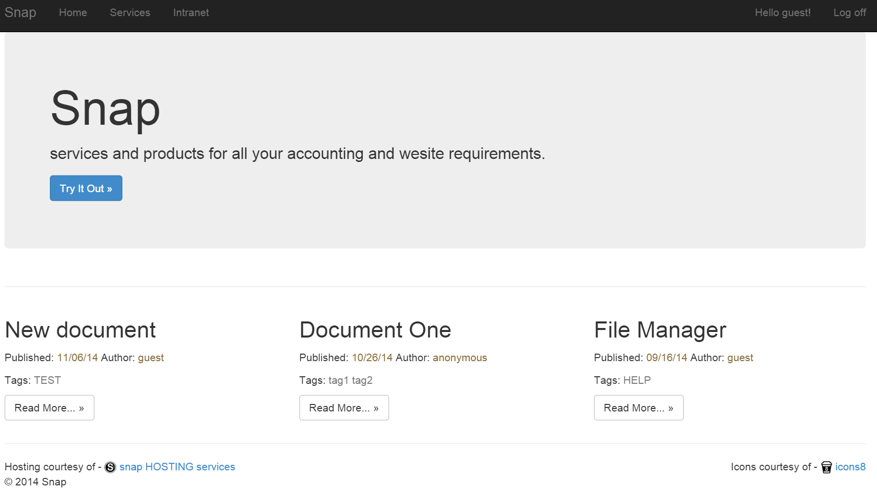
For example, in a wide browser window the home page created by the Web Forms template looks like the following illustration:
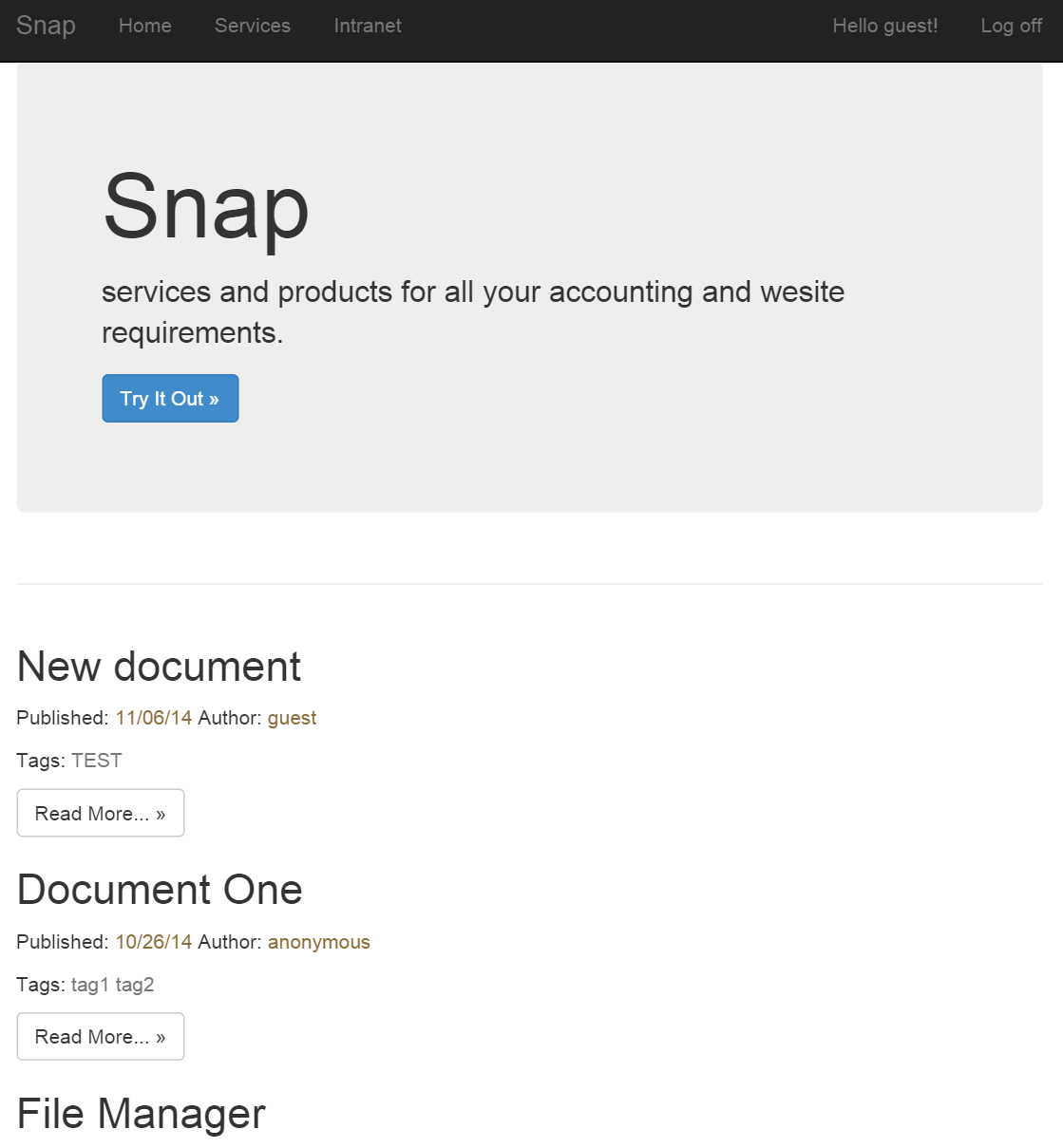
Make the window narrower, and the horizontally arranged columns move into vertical arrangement:
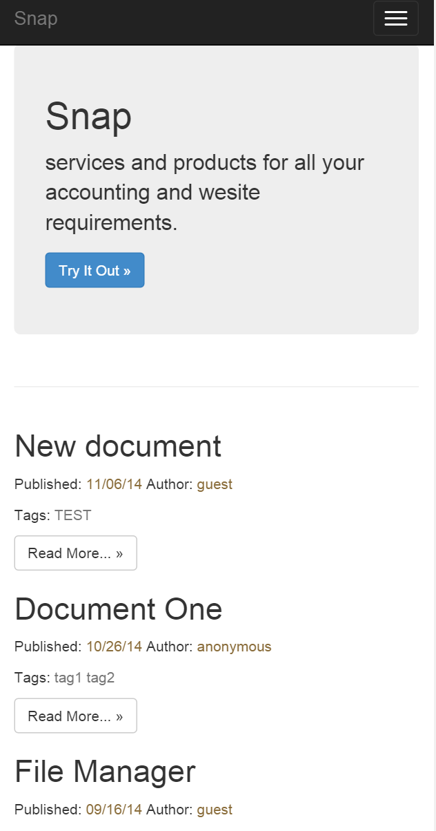
Narrow the window a little more, and the horizontal top menu turns into an icon that you can click to expand into a vertically oriented menu:
You can also use Bootstrap's theming feature to easily effect a change in the application's look and feel. For example, you can do the following steps to change the theme.
Run the project again, and the application has a new look. The following illustration shows some of the available themes for download:
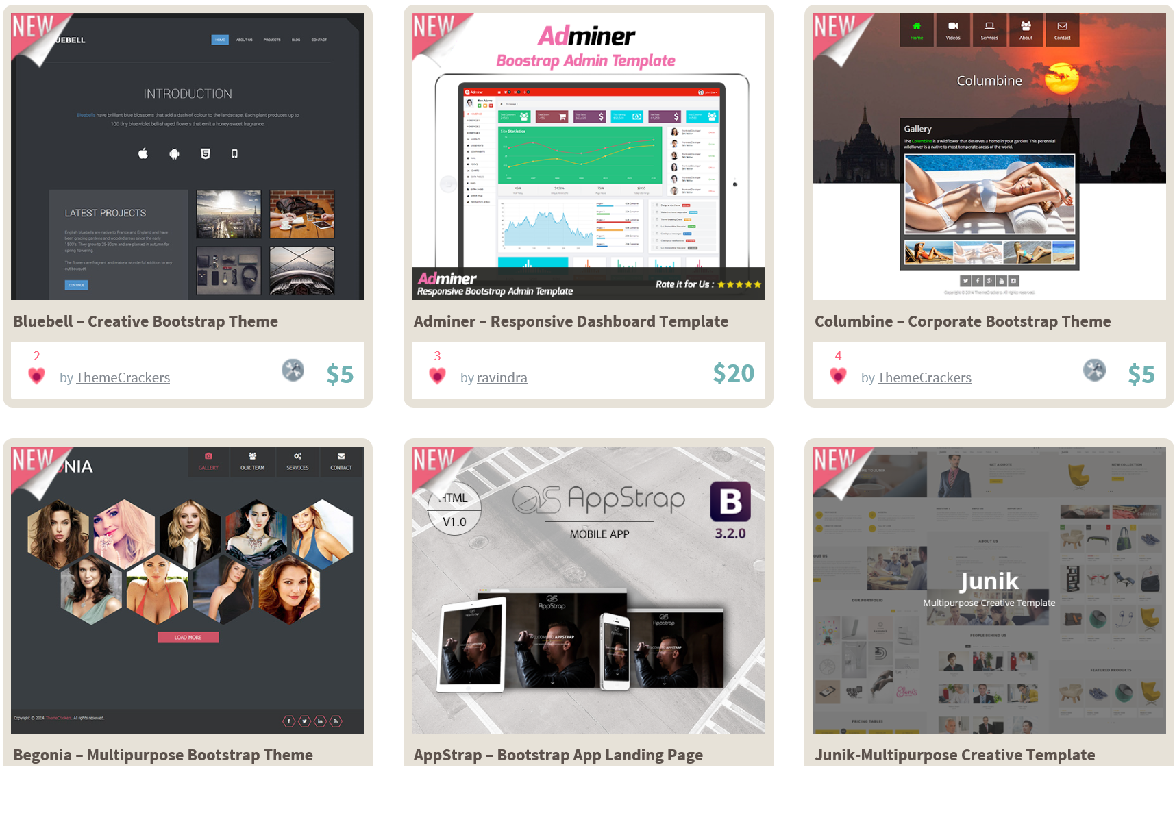
Many Bootstrap themes are available, both free and premium versions. Bootstrap also offers a wide variety of UI components, such as drop-downs, button groups, and icons. For more information about Bootstrap, see the Bootstrap site.
If you use the Web Forms designer in Visual Studio, note that the designer doesn't support CSS3, so it doesn't accurately show all the effects of Bootstrap themes or responsive layout changes. However, the Web Forms pages will display correctly when viewed with a browser.
Millions of amazing sites across the web are being built with Bootstrap. Get started on your own with our growing collection of examples or by exploring some of our favorites.